
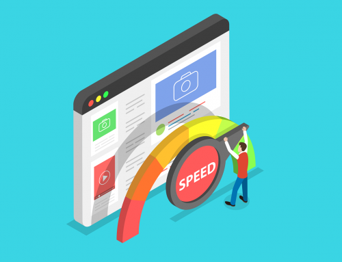
Front End Performance Best Practices
When developing a front-end website, it’s important to follow best practices to ensure the website is fast, accessible, user-friendly, maintainable and secure. Users expect near instant load times when browsing the internet, and for the site to be appropriately optimised for their device.
Front-end performance directly affects user experience, engagement, and even SEO rankings. Slower and poorly optimised website front-ends result in an increased bounce rate, decreased conversions and more frustrated customers.
Implementing best practices will help deliver a seamless user experience across all devices and network conditions.
Discussed below are some of the best practices for ensuring your website’s front-end loads quickly for your customers.
Minify CSS & HTML
Minification is the act of reducing the size of a file by eliminating unnecessary characters. This involves removing unnecessary characters such as white spaces, comments and line breaks from the front-end CSS and HTML, reducing its size and having no impact on functionality.
Reduced size, means a reduced download, resulting in a faster website for visitors.
It’s always important to test your website after minifying CSS and HTML files. This is to ensure everything works as expected, as the process can sometimes break things, especially if there are issues with CSS selectors or incorrectly closed HTML tags.
Efficient Browser Caching
Caching is a fundamental technique in front-end performance optimisation. Your website should effectively leverage browser caching to ensure that visitors aren’t fetching resources on every page load. Browser caching involves storing frequently accessed data, such as images, scripts and stylesheets.
Efficient browser caching results in a faster website experience for repeat visitors to your organisation’s websites.
Optimise Images
Images are often the largest elements of the front-end of a website in terms of download size. Responsive images are a great way of making your page load faster. This is a practice that involves providing different resolution images depending on the device it’s being viewed on. An example of this is a header image using a higher resolution version only on a large desktop display, instead of a mobile device.
Compression tools also allow for image sizes to be displayed at a reduced size on all devices. Modern compression tools allow images to be shrunk with a negligible effect on the image quality. Ultimately, these reduced image sizes load faster and use less bandwidth.
In recent years web developers have been slowly moving from traditional image formats (such as PNG and JPEG) to newer, superior lossless and lossy compression for images on the web. These formats include WebP and AVIF.
Efficient Font Rendering
Custom fonts on a web page require rendering when the page is loading. You should consider subsetting the font to include only the characters required for the website (for example, only including the Latin alphabet if the website is only in English). This helps reduce load times and speeds up pages with custom fonts.
Another best practice is to limit the number of fonts on a page. Minimising the number of web fonts and font weights/styles you use on your site will reduce the number of requests and the amount of data that needs to be downloaded.
Content Delivery Network
A Content Delivery Network (CDN) caches and delivers static content such images, CSS and JavaScript from a network of servers geographically closer to the user. This reduces latency, speeds up load times and helps improves scalability.
Choosing a Content Delivery Network closer to the user’s geographic location will also result in reduced latency and faster load times.
Are you preparing to alter your tech stack this year? If so, contact us today on +353 1 8041298, or click on the link below to our contact form.